Redesigning BockleyGallery.com
Located in Minneapolis’s Kenwood neighborhood, just down the block from Louise Erdrich’s Birchbark Books, Bockley Gallery is tiny—somewhere around 500 square feet—but represents some of my favorite emerging and mid-career artists, including Pao Houa Her, Andrea Carlson, Postcommodity, Dyani White Hawk, and the late Jim Denomie—artists recently featured in high-profile exhibitions including the Whitney Biennial, Paris Photo, documenta, and the Carnegie International. Truly, Bockley has an impact, purview, and level of prestige little known in the Minneapolis scene.
The challenge: getting the website to match the gallery’s increasing ambitions and desire for expanded reach, and to do so while expressing the humility of both the physical gallery and its gallerist. As project manager on the site redesign and the gallery’s editor (2021–late 2023), I suggested we bring on Jaś Stefański, designer of The Ostracon, the Warhol Foundation–funded art writing site I co-founded, and former interactive designer at the Walker Art Center. Steeped in the nuances of contemporary aesthetics, digital publishing, and UX best practices, he was a perfect fit for the job.

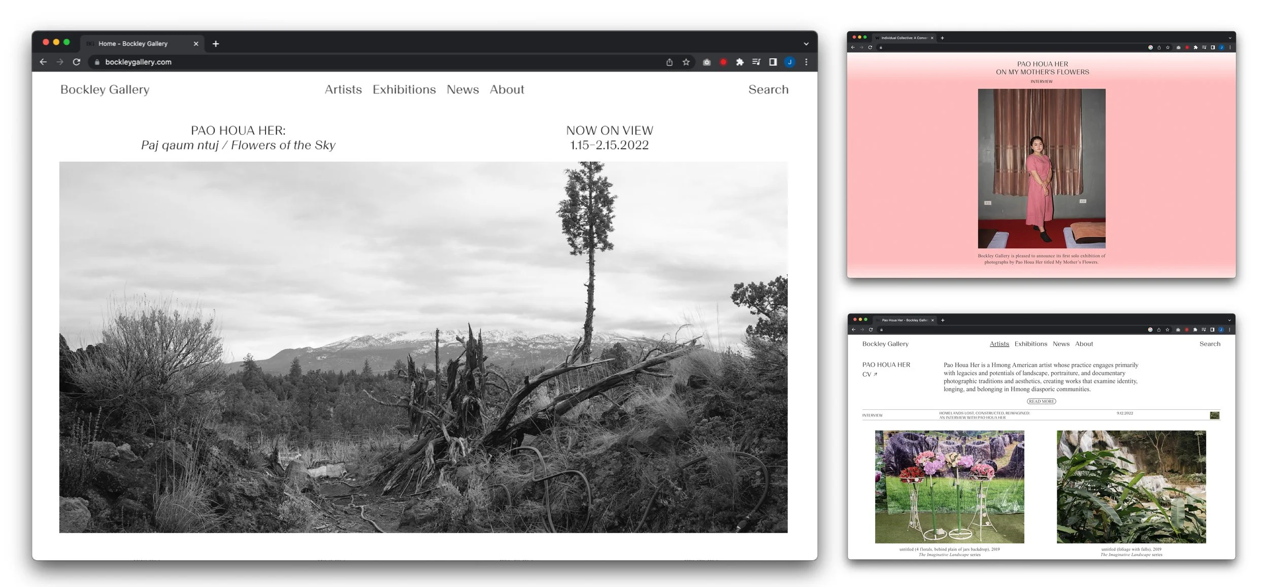
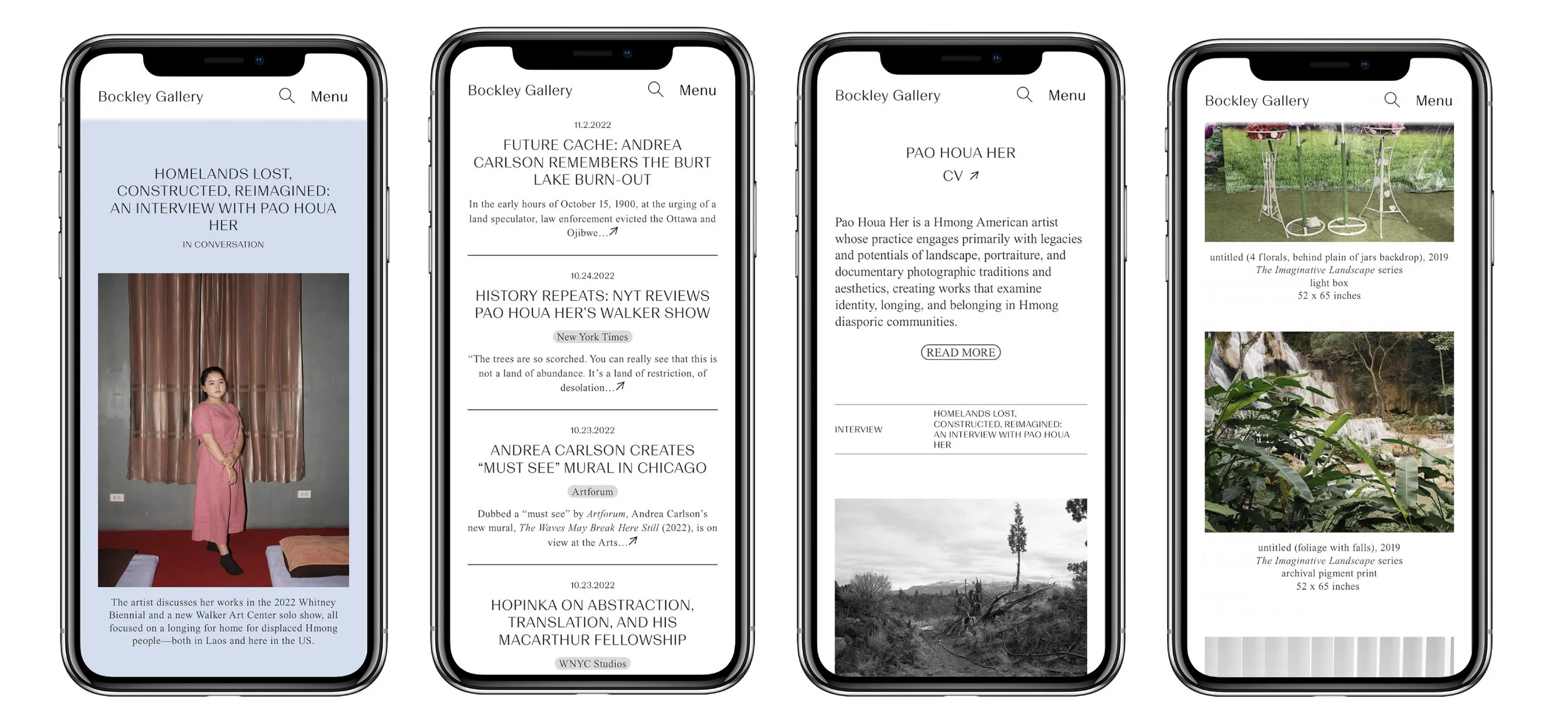
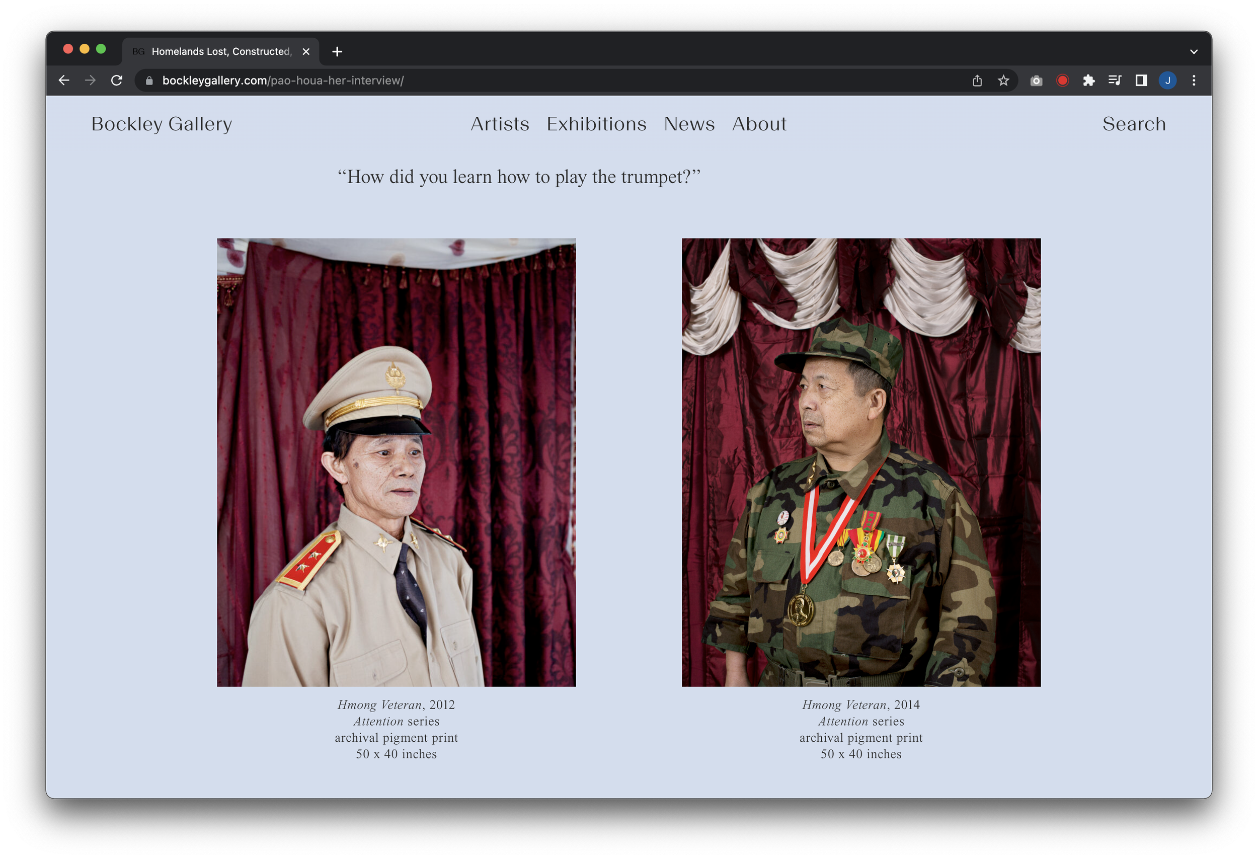
The aim was simplicity: we wanted to honor the understated look, and historic legacy, of the existing site while updating it with more contemporary aesthetics and functionality: a new identity (anchored by the typeface Basel, designed for Optimo by Chi-Long Trieu), responsiveness, better SEO, lots of white space, and an intuitive interface (WordPress’s Gutenberg) that would allow gallery staff to easily make updates. And we wanted to foreground the gallery’s growing body of original content. (To date, we’ve published six pieces: interviews with Pao Houa Her, Eric-Paul Riege, Maggie Thompson, Cara Romero, and Dyani White Hawk, and a curatorial essay on artist George Morrison by Bob Cozzolino of the Minneapolis Institute of Art.)
As a nod to the gallery’s understated approach, we set the type for the gallery’s name at the same size and weight as the items in the nav bar. The gallerist’s name, this choice telegraphs, is only as important as the artists and the exhibitions it presents. The homepage always leads with the current (or upcoming) exhibition—usually represented in typographic form—followed by news items about its active roster of artists.
As a visitor scrolls past recent news, the white background fades to a wash of color, a subtle nod that a transition—from the business side of the enterprise to the contextualization of its artists’ work through original storytelling—takes place. This color can then be carried through to the background of the story itself.
Smaller gestures punctuate the site in both mobile and desktop versions, from subtle animations (on the exhibitions page, the date automatically toggles to “On view”) to an exhibition list sortable by run date, artist’s name, or show title. Nice touches that don’t dazzle but quietly demonstrate a thoughtful sensitivity to the user’s experience.

As a Minneapolis gallery punching above its weight, the transformation of bockleygallery.com—launched in September 2022—is intended to convey that something special is emanating from that tiny space in Kenwood, and in that, I feel we succeeded.